

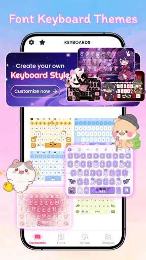
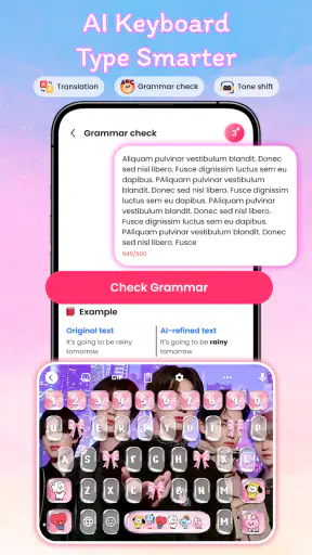
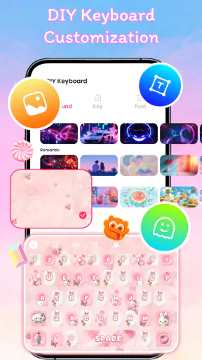
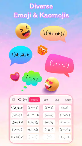
Typing can feel surprisingly personal, especially when most of our conversations happen through the same small keyboard every day. Font Keyboard Themes, Emoji takes that familiar space and turns it into a personalization tool for chats, captions, comments, and social posts. I tested it as an Android customization app from Lutech Studio, and my first impression was clear: it is designed to make ordinary messages look more playful without asking users to redesign their entire phone.
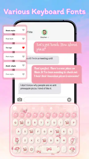
The appeal is immediate because the change appears where you already type. Instead of opening a separate editor, creating decorative text, copying it, and pasting it into a conversation, you can choose a different lettering style or emoji-focused keyboard theme while composing. That makes it more convenient than many standalone font generators, particularly when the goal is a quick visual touch rather than a carefully designed graphic.
Still, novelty is not the same as lasting usefulness. A themed keyboard can be fun during the first few days and then become background decoration. My main question was whether this app earns a permanent place on a phone after the excitement of trying different styles fades. The answer depends heavily on how often you message, how much you care about expressive text, and whether you are comfortable trading a little practicality for a more distinctive keyboard.
What the first week feels like
During the first week, the strongest part of the experience is experimentation. I found myself trying different looks for short messages, profile captions, and casual replies simply because the keyboard made familiar typing feel less routine. The store summary focuses on cute fonts and cool emoji keyboard themes, and that description matches the app’s central purpose without needing much interpretation: it is a visual layer for people who want their writing to look different.
The app is free to install, which lowers the barrier to trying it. It is listed for Everyone, so its intended audience is broad rather than limited to a particular age group. On compatible Android phones, the minimum requirement is Android 8.0, making it accessible to many devices that are no longer considered new. I appreciate that this kind of customization does not require a powerful handset or a separate design workflow.
One useful way to approach the first setup is to choose a style for a specific purpose instead of changing everything at once. For example, I would keep a readable option for everyday conversations, then reserve more decorative lettering for captions, playful group chats, or birthday messages. That small habit prevents the keyboard from becoming tiring too quickly and makes the visual changes feel intentional.
The emoji side is valuable for a different reason. Fonts change the appearance of words, while emoji themes change the mood of the whole typing experience. Someone who regularly sends expressive reactions may get more repeat use from the emoji presentation than from decorative lettering alone. In my experience, the best early use is not trying to make every sentence look unusual; it is having a few styles ready for moments when a normal keyboard feels too plain.
There is also a practical distinction between text that looks attractive inside the keyboard and text that remains readable after it is sent. Decorative characters can be charming in a short status or greeting, but dense styling may slow down reading, especially in longer messages. I recommend testing a chosen font in the exact apps where you communicate most. A style that looks excellent during typing may be less comfortable when viewed in a busy conversation.
Useful routines instead of constant switching
A simple workflow makes the app feel more useful. I would start by selecting one everyday style, one playful style, and one emoji-oriented option. Then I would use the everyday choice for normal messaging and switch only when the context benefits from it. This avoids spending more time browsing themes than actually writing. It also gives the keyboard a role in your routine instead of leaving it as a collection of options you rarely revisit.
Another practical tip is to keep decorative text short. A stylized greeting, name, heading, or reaction usually has more impact than an entire paragraph filled with unusual characters. This is not a limitation unique to this app; it is the trade-off built into decorative typing. The more visual variation you add, the more you risk reducing speed and clarity.
For social users, the app can be particularly handy when preparing several kinds of content in one sitting. I could imagine using a clean font for a profile note, a brighter style for a casual caption, and emoji-heavy typing for replies. That gives the keyboard a small but repeatable role in a content routine. It is more useful than treating it as a novelty that is opened once and forgotten.
Does it still matter after the first month?
After the initial curiosity fades, the question becomes whether the app saves effort or adds enough personality to justify keeping it installed. Compared with a typical system keyboard, it offers more visual choice and a stronger sense of customization. Compared with a dedicated font-copying app, its advantage is being available during composition rather than forcing a separate copy-and-paste step every time.
That convenience matters most for people who send many short messages. If you regularly write captions, comments, greetings, or informal replies, having styles close to the typing area can make experimentation feel natural. The value is less obvious for someone who mainly writes work messages, long notes, or formal emails. In those situations, readability and speed usually matter more than decorative presentation, and the standard keyboard may remain the better daily tool.
The app has reached a substantial audience, with over five million installs and an average score of 4.5 from around fifty-one thousand ratings. Those figures suggest that the concept works for many people, but they do not guarantee that every style will suit every phone or communication habit. I treat them as evidence of broad interest rather than proof that the app will become essential for me.
Its current version is 31.0, and the developer is Lutech Studio. Keeping an app updated can help with general compatibility, but long-term satisfaction still depends on whether the available styles continue to feel fresh. A personalization tool has a difficult maintenance challenge: once users have found a favorite appearance, new choices need to offer a meaningful reason to return rather than simply adding more items to browse.
For me, recurring value comes from having a small set of reliable uses. A themed keyboard works well when I want a message to feel warmer, more humorous, or more visually recognizable. It is also useful for people who enjoy matching their keyboard with a broader phone theme or online persona. But if I am not sending expressive messages, the app quickly becomes something I remember only when I see it in my app list.
Where it beats ordinary alternatives
The regular keyboard wins on familiarity, speed, and usually a more neutral appearance. It is the sensible choice when accuracy is the priority. Font generators, meanwhile, can offer decorative text without replacing the keyboard, which may appeal to users who want occasional special characters but do not want a customized typing environment all the time.
Font Keyboard Themes, Emoji sits between those options. Its strongest advantage is immediacy: the customization is connected to the act of typing. Its weakness is that a keyboard is a fundamental phone tool, so any extra visual layer must prove that it does not make everyday writing feel slower or less comfortable. I would choose this app over a separate generator for frequent casual use, but I would not recommend replacing a dependable standard keyboard solely for occasional decorative text.
There is also a social trade-off. A distinctive font can help a short message stand out, but it can also make the sender appear less clear or less serious in the wrong setting. I would avoid decorative styles in professional chats, support requests, school communication, or anything that needs to be understood quickly. The app is at its best when the recipient already understands that the message is playful.
The maintenance cost users notice later
Personalization apps often seem effortless until the phone’s keyboard becomes part of a daily habit. The first maintenance task is deciding whether the visual benefit is worth any extra attention during typing. If I have to keep changing styles, correcting unfamiliar layouts, or switching back for serious messages, the customization can become a mild interruption rather than a convenience.
I also recommend checking the keyboard’s behavior in several apps before settling on it as a default. Messaging apps, social networks, note tools, and browsers can make decorative text feel different because the surrounding interface and text field are not the same. A style that works nicely for a short chat may feel awkward in a long note. Testing across your real routine is more useful than judging the keyboard from its theme-selection screen.
Another maintenance issue is restraint. The more themes and fonts an app presents, the easier it is to keep searching for a “perfect” look. That can create a loop where customization replaces communication. I get more value by choosing a few dependable options and ignoring the rest unless I have a particular occasion in mind.
In-app purchases range from $2.99 to $24.99 per item. Since the app is free to start, users can decide whether the available experience is already enough before spending anything. I would be cautious about purchasing several decorative items early. The lasting test is whether one style becomes part of your routine over several weeks, not whether many choices seem attractive during the first session.
This pricing structure also changes how I judge the app. A free personalization tool can be worthwhile even if I use it only occasionally, but paid extras need to provide more than a brief burst of curiosity. Before buying, I would ask myself whether I have a recurring use for the specific item, whether I will use it across different conversations, and whether I am comfortable returning to a simpler style when readability matters.
Privacy-minded habits and practical caution
Because a keyboard is involved, I would treat installation as a decision that deserves more attention than downloading an ordinary wallpaper app. I would read the system prompts carefully, understand which keyboard is active, and avoid typing confidential information through a customized keyboard unless I am comfortable with the arrangement. This is sensible behavior for any third-party keyboard, not a claim about this particular developer or its policies.
I would also keep a familiar alternative available. If the themed keyboard ever feels inconvenient, switching back to the phone’s usual keyboard should be part of the plan rather than a last-minute scramble. That backup matters for passwords, work communication, long documents, and situations where speed is more important than appearance.
What causes the novelty to wear off?
The biggest source of fatigue is repetition. A font that looks exciting in the first few conversations may feel ordinary after it appears in every message. Emoji themes can have the same problem: once the visual treatment becomes familiar, it stops adding much emotional value. This does not make the app unsuccessful; it simply means its appeal is cyclical. I would expect to use it more around events, social projects, or mood changes than as a constant visual upgrade.
Readability is another pressure point. Decorative lettering is most effective in small doses, and some users may find unusual shapes slower to scan. If your conversations involve long explanations, detailed instructions, or frequent corrections, a standard keyboard may feel more comfortable. The app should support expression, not make every sentence a decoding exercise.
There is also the issue of context switching. A person who alternates between casual chats and formal communication may need to change styles often. That is manageable when the switch is quick, but it can reduce the sense of seamlessness that makes a keyboard useful. My practical solution is to keep one restrained style as the default and treat the more decorative options as occasional tools.
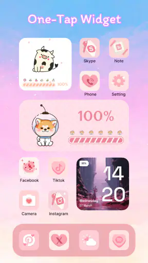
Some users may simply prefer customization that changes the phone’s appearance without changing the way they type. For them, wallpapers, icons, or a system theme may offer a more consistent result with less impact on writing speed. Font Keyboard Themes, Emoji is a better match for people who want their words themselves to carry some visual personality.
The app is also not the right choice for someone seeking a full graphic-design editor. It can make typed communication more distinctive, but it should not be confused with a tool for creating polished images, branded layouts, or elaborate social artwork. If your goal is precise control over spacing, composition, and visual hierarchy, a dedicated design app will remain more capable.
Who will keep using it?
I see the strongest fit among people who spend a lot of time in casual messaging and enjoy small forms of self-expression. It suits users who like changing the mood of a conversation, preparing playful captions, or giving greetings a more personal appearance. It may also appeal to younger users and families because the content rating is Everyone and the concept is easy to understand without design experience.
It is less convincing for users who value a plain, fast, predictable keyboard above all else. If you rarely use emoji, almost never post captions, and prefer messages to look identical across devices, the app’s main benefit may not justify adding another layer to your typing habits. Likewise, people who write long-form text on their phones may find the decorative focus distracting.
One realistic scenario shows where it earns its place. Imagine preparing a birthday message in a group chat: I might use a readable decorative font for the opening line, add a few expressive emoji, and then return to a normal style for the actual details. The app helps the message feel prepared rather than generic, while the restrained workflow prevents the visual treatment from overwhelming the content.
Another scenario is a social account where captions need a recognizable tone. I could use one consistent style for short headings or recurring posts, then keep the body text conventional. That creates a small visual signature without forcing every update into an ornate format. The key is consistency and moderation, not maximum decoration.
My long-term verdict
Font Keyboard Themes, Emoji earns lasting space only when personalization is part of how you communicate, not merely something you enjoy browsing. In my experience, it is more useful than a one-off font generator for frequent casual typing because the styles are connected to the keyboard itself. It is also easier to try because the app is free, supports Android 8.0 and later, and is aimed at an Everyone audience.
Its limitations are equally important. Decorative text can become tiring, readability can suffer in longer messages, and frequent switching may undermine the convenience of using a keyboard. The in-app purchase range also makes patience worthwhile: try the free experience, identify a repeatable use, and only then consider whether an individual purchase adds enough value.
I would recommend it to a friend who enjoys expressive chats, emoji-heavy conversations, and occasional visual changes in captions or greetings. I would not recommend making it the only keyboard for someone who writes professionally, needs maximum speed, or prefers a completely neutral typing experience. Keeping the standard keyboard available is a sensible compromise.
Overall, Lutech Studio’s app succeeds as a lightweight way to make everyday typing feel less ordinary. Its first-week appeal is easy to understand, but its month-to-month value comes from selective use: a few trusted styles, clear situations, and enough restraint to keep the novelty from becoming noise. If that matches your habits, it can remain a useful personal touch rather than another customization app that disappears after installation.


